Notice how the metaphor is sharpened by the matching detail, the white feathers that remind you of the child's white hair.
When your picture has a striking feature, try to work an echo of it into the text.
Here's a picture used as a punchline, from Gaia's Wasp.
Notice how the last word before the picture (astrology) tells the reader how to interpret the picture.
Or a feelustration might compel the reader to reinterpret the last sentence, as in this example:
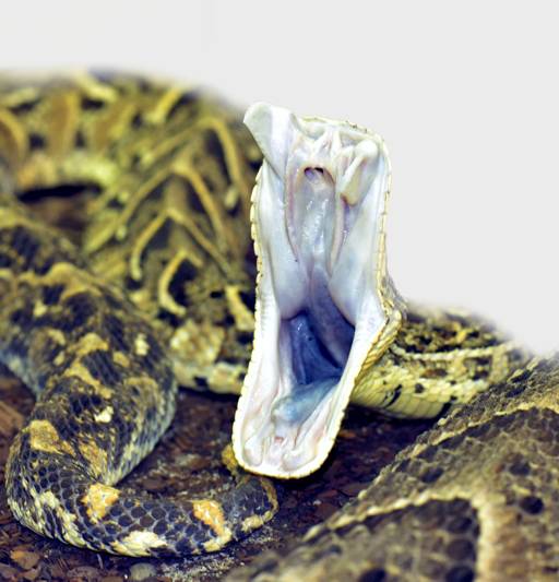
I tiptoed to the door, trying not to make a noise. I pressed my ear to the wood, then jumped when the knocker banged again. Was I being paranoid? I scuttled over to the side window and peeked through the curtain.
It was just the UPS guy in his brown uniform, standing on my porch with a white-wrapped package. As I watched, he raised the package toward my door, and waited expectantly.

The matching colors, brown and white, make the snake feel more like the UPS guy.
Here's how feelustration actually looks in a printed novel. In this scene, a British colony ship has been disabled by a freak wave, and is slowly sinking.
Move the slider bar to see the next spread. Pinch or CTRL-Mousewheel to zoom.
When the reader sees the humping lambs, he reinterprets the priest's last comment. Ditto for the pirate flag.
The picture of a drowning woman foreshadows the ship's fate.
Ignore the fertility statue. It's just a scene separator, and a theme image for this storyline.
As a rule of thumb, a feelustration should be explained in the sentence just before the picture. But if the picture dominates the page, then it can be explained at the end of the page, as the finale.
Here's an example from Dandelion Slap. In this scene, Lucifa the alien has landed her spaceship in England, and organized a festival without a permit. The English prime minister is worried about the precendent, so he is talking to the local chief of police, deciding how to respond.
At first, the beach picture seems irrelevant, so the reader feels mild tension, wondering whether he missed something or the picture is just meaningless filler. This tension is resolved at the last sentence, where the menace of the alien beachhead is explained in the words crowded around the anchor.
The anchor metaphor is more clear because it is physically close to the corresponding words.
A subtle feature of this image is the color change from sky to sea, which marks the moment the prime minister sees the real threat.
A feelustration can sharpen a future event by foreshadowing it. Here's an example from Dandelion Slap, with some text blurred. In this scene, a low-class man is visited by an old lady space alien. He has just stolen a gold coin from her spaceship's cupholder.
The left page (the blurred text) describes events that seem harmless. But the jellyfish looms on the opposite page, foreshadowing a menace. The sense of menace grows as the picture approaches.
The colors in the text feel more vivid because they match colors in the picture. The red jellyfish echoes the fountain of gore erupting from the man's head. This effect is called, priming. Most readers won't notice, at least not consciously, but if the jellyfish were the wrong color, say green, the mismatch would make the colors feel lifeless.
The bully crowding the old lady into a narrow space is more vivid because it's described in words crowded into a narrow space.
Feelustration can reinforce the reader's reaction to a past event. Here's an example from Gaia's Wasp. In this scene, Tom flirts with an artist at her debut show.
Move the slider bar to see the next spread. Pinch or CTRL-Mousewheel to zoom.
The stricken bird foreshadows a tragedy. After the tragedy, the reinforcing image, the car crash, gains power from its position on the Left page, where the reader doesn't see it coming.
In a feelustrated novel, every word is placed in a specific spot on the page. (That is, the text does not reflow, even in the ebook verson.) Fixed formatting is a nuisance for the author, but it's a rewarding nuisance. Here's an example. (Click the image for a big, printable version.)
Notice how the color change (from blue to black) reinforces the theme of each line.
The font size grows in a crescendo that climaxes with the line, and blow the paper walls aside, trangressing the text boundary. If you don't know why, you're not a married man.
Then the shrinking font reinforces the theme of, I am diminished.
Oh, the possibilities. The virgin field of feelustration is wide open to your plow.
