This list is incomplete because feelustration is new, and its possibilities have not been plumbed by anyone. I hope you'll go deeper.
Here's a hole to get you started.
Feelustrations are metaphors, so they can be misinterpreted, and will be. In this regard, you will be amazed by readers' cleverness. Fortunately, when a reader looks at a picture, his interpretation will be guided by what he just read.
So be strategic, when you write that final sentence before the picture.
For example, this feelustration doesn't work.
Today was my first performance evaluation. It didn't go exactly as I expected.
Afterward, I went to Burger King for lunch.
This scene is weak because the last sentence before the picture is not about the picture.
Here is the scene done correctly.
Today was my first performance evaluation. It didn't go exactly as I expected.
Afterward, I went to Burger King for lunch.
Moving one sentence made all the difference.
Questions are great setups for feelustrations. Here's an example from Gaia's Wasp:
"I've never worked for a small company. On a typical workday, what would I do?"
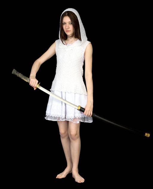
In a feelustration, animals can stand in for humans. This trick lets you depict a scene straight from your story without stepping on the reader's mental image of your characters.
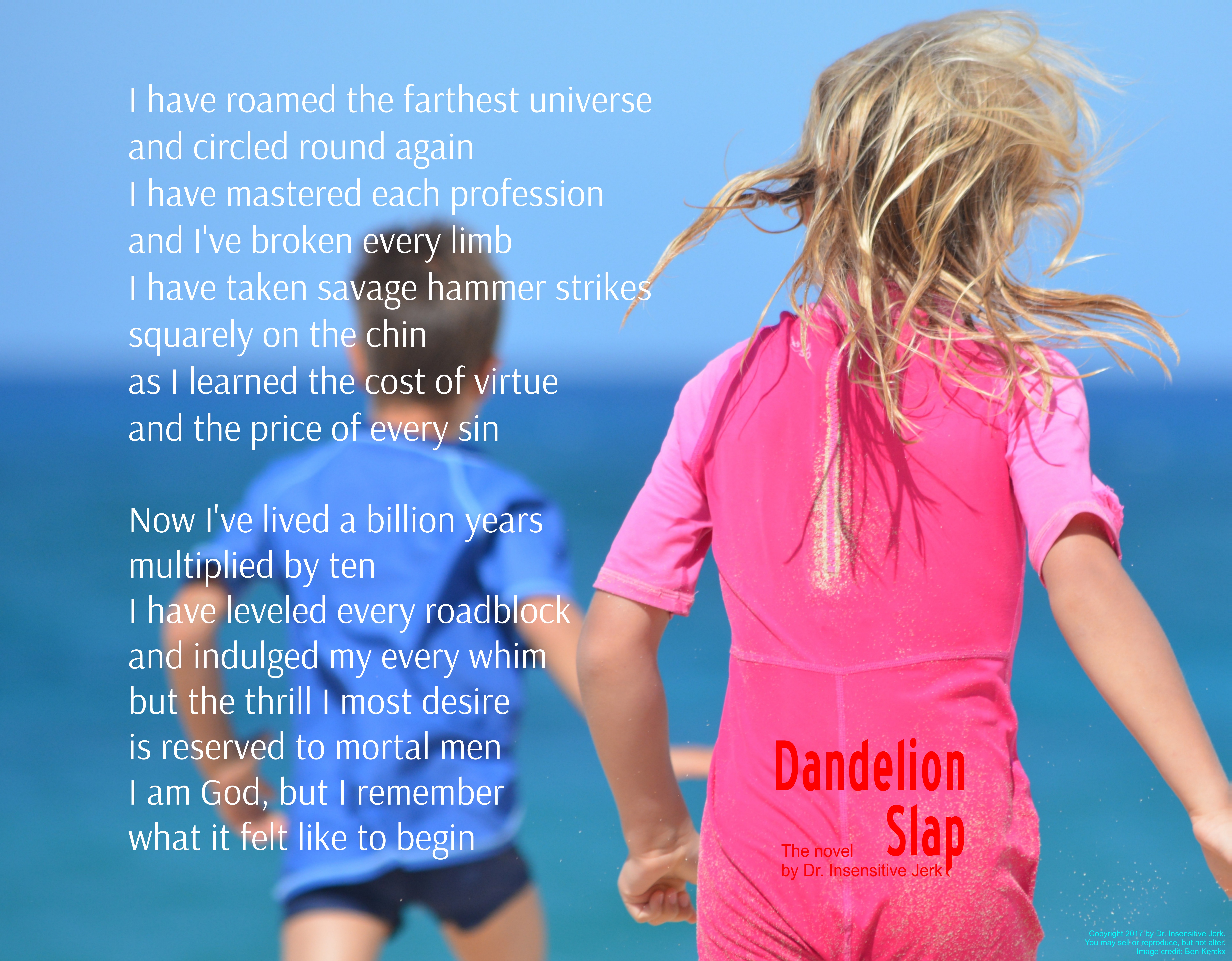
Here's an example from Dandelion Slap.
The lookout seemed vigilant as always. She stood atop the biggest boulder, turning a slow circle.
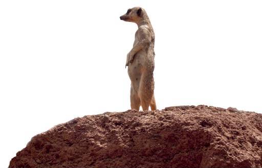
This scene's soul is, standing guard, and the characters are human.
When the reader sees a complicated picture, he won't try to find Waldo, and you don't want him to, because that would break his immersion. If he's caught up in the story, he will spare your pictures only a glance. So feelustrations should be big and simple.
We've all seen traditional illustrations in novels, and they didn't really help. So an experienced reader might not spare your feelustrations even a glance. Ironically, this problem is worsened by good feelustrations, since they pull the reader into the story.
Nonetheless, experiments have shown that the human brain is primed by images that don't reach conscious awareness. (For example, pictures shown briefly, or only in the visual periphery.) Thus, even an unnoticed feelustration can make reading more vivid.
Or maybe that's just psychobabble. Better to make the pictures noticeable.
Consider this picture of a broaching whale.
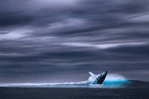
This image is nicely composed to capture the ideas of, solitude, and, rare creature showing itself. This picture could prime a brief sighting of a reclusive billionare. Unfortunately, this picture might not register in the reader's brain, unless he takes the time to study it, which he probably won't.
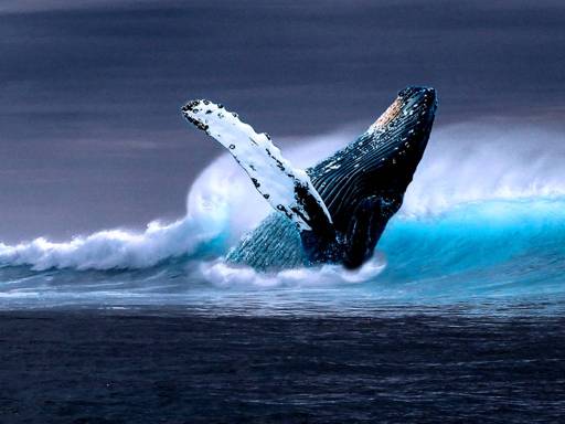
The same image, cropped, is not so nicely composed, and does not convey solitude. But it's more likely to affect the reader, even from his peripheral vision.
Which of the two images is better? I don't know. But the first image (the one that requires more attention) should be placed somewhere hard to ignore.
In a two-page spread, the top of the Left page is the hardest spot to ignore, because it's where the reader looks for the first paragraph.
The top of the Left page is also the best spot for a punchline, since the reader won't see it coming.
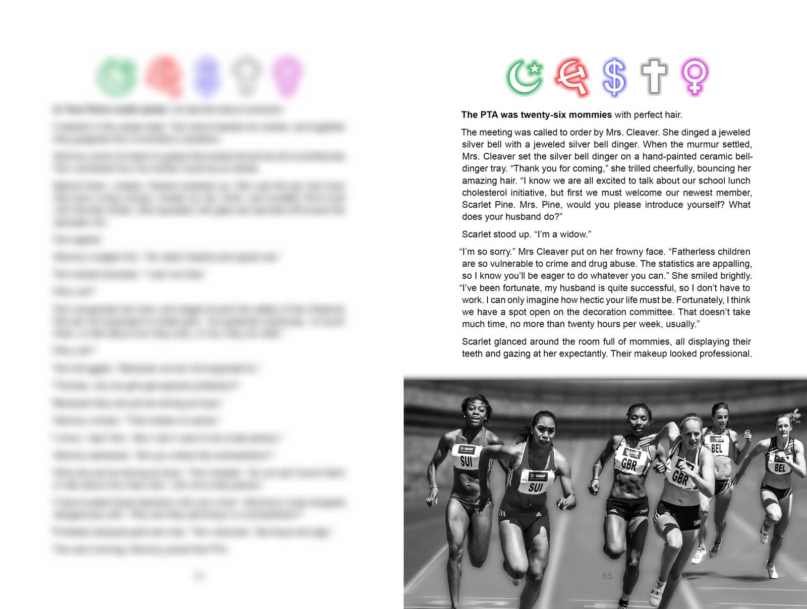
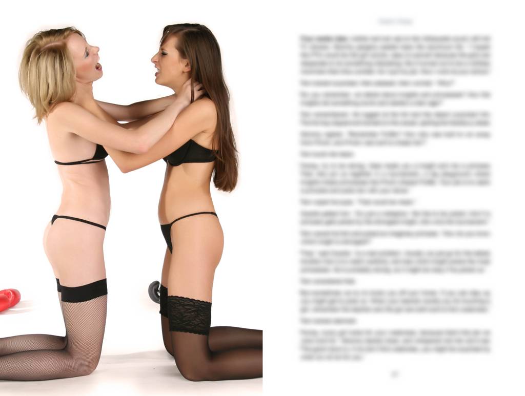
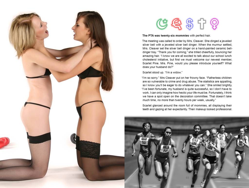
Here is an example from Gaia's Wasp, with irrelevant text blurred. In this scene, a harried working mom goes to her first PTA meeting. You needn't read the whole page; just skip down to the last sentence before the picture.
Move the slider bar to see the next spread.
I put the punchline on the Left page, where the reader won't see it too soon.
But the pages could be swapped. The wrestling girls still belong on the Left page, but instead of a punchline for the previous page, now they prime the next page, giving up the surprise in return for making the text more vivid. Here's how that looks, so you can judge for yourself which is better.
In a printed book, the reader sees a two-page spread. Don't be afraid to fill it with one picture. A beautiful full-spread feelustration feels generous, with no distractions to dilute its power.
But you also want to sell ebooks. Unfortunately, most eboook viewers show only one page. So when you use a full-spread picture, put the interesting bit on the Right page, where single-page viewers will show it last.
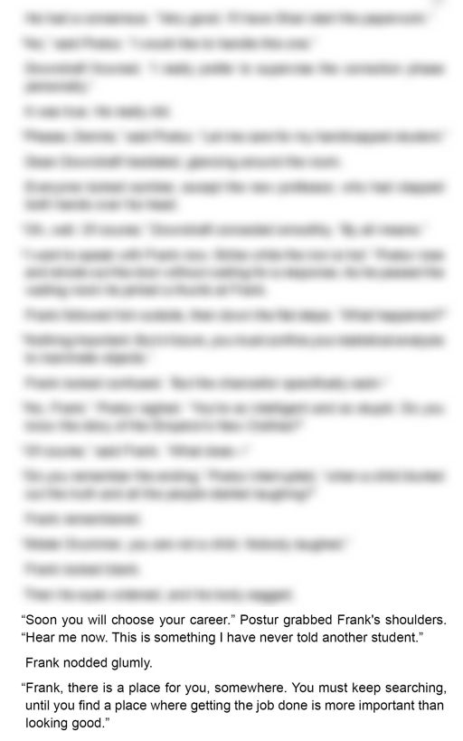
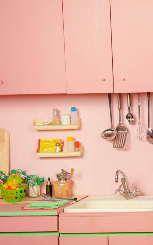
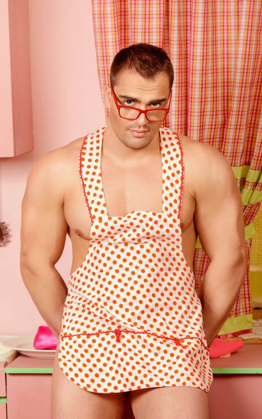
In this example from Gaia's Wasp, a professor offers career advice to a student with poor social skills. I'll show it in a single-page window, as it would appear on a Kindle Fire, with irrelevant text blurred.
Move the slider bar to see the next page.
The full-spread picture is oriented properly (punchline on the Right page) so the boring page is foreplay for the punchline.
Now see it with the picture flipped the wrong way, moving the interesting part to the Left page.
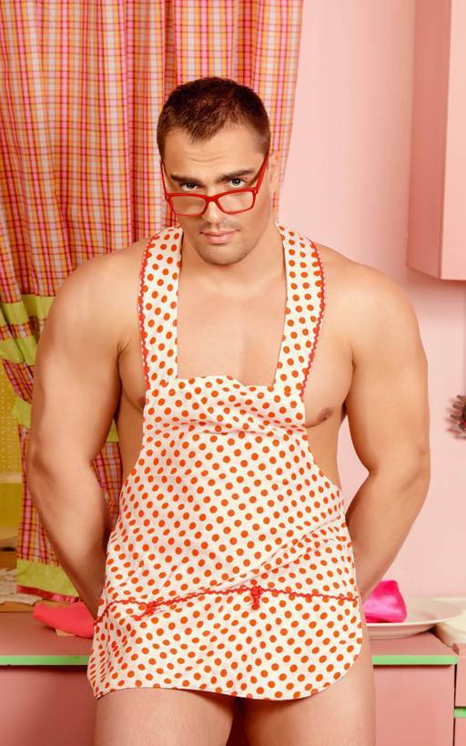
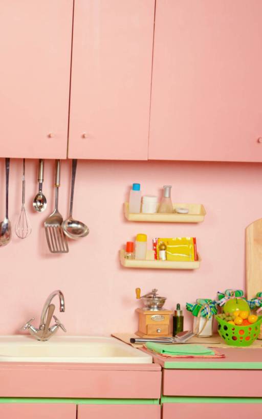
The sentence just before the picture tells us how to interpret the picture, so we know this picture is, a place where getting the job done is more important than looking good. But it feels wrong, because the last half of the picture, like the last line of a joke, is supposed to be the punchline. This picture's punchline is just an empty kitchen.
Even worse, the last page is boring, because we've already seen the interesting bit.
In that last example, the picture filled the spread because it was dramatic and surprising. But the best full-spread pictures punch the reader in the heart.
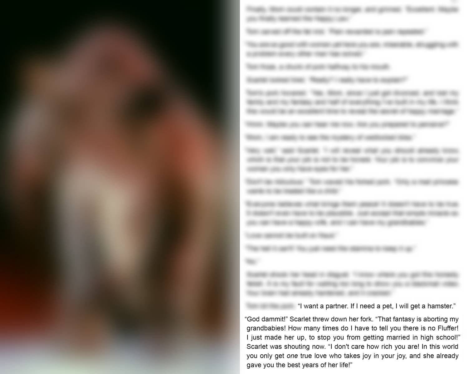
Here's an example from Gaia's Wasp, with irrelevant text and image blurred. In this scene, Tom just divorced his wife because she could not be Fluffer, a partner who takes joy in his joy, like his mother. Now Tom is discussing that decision with his actual mother.
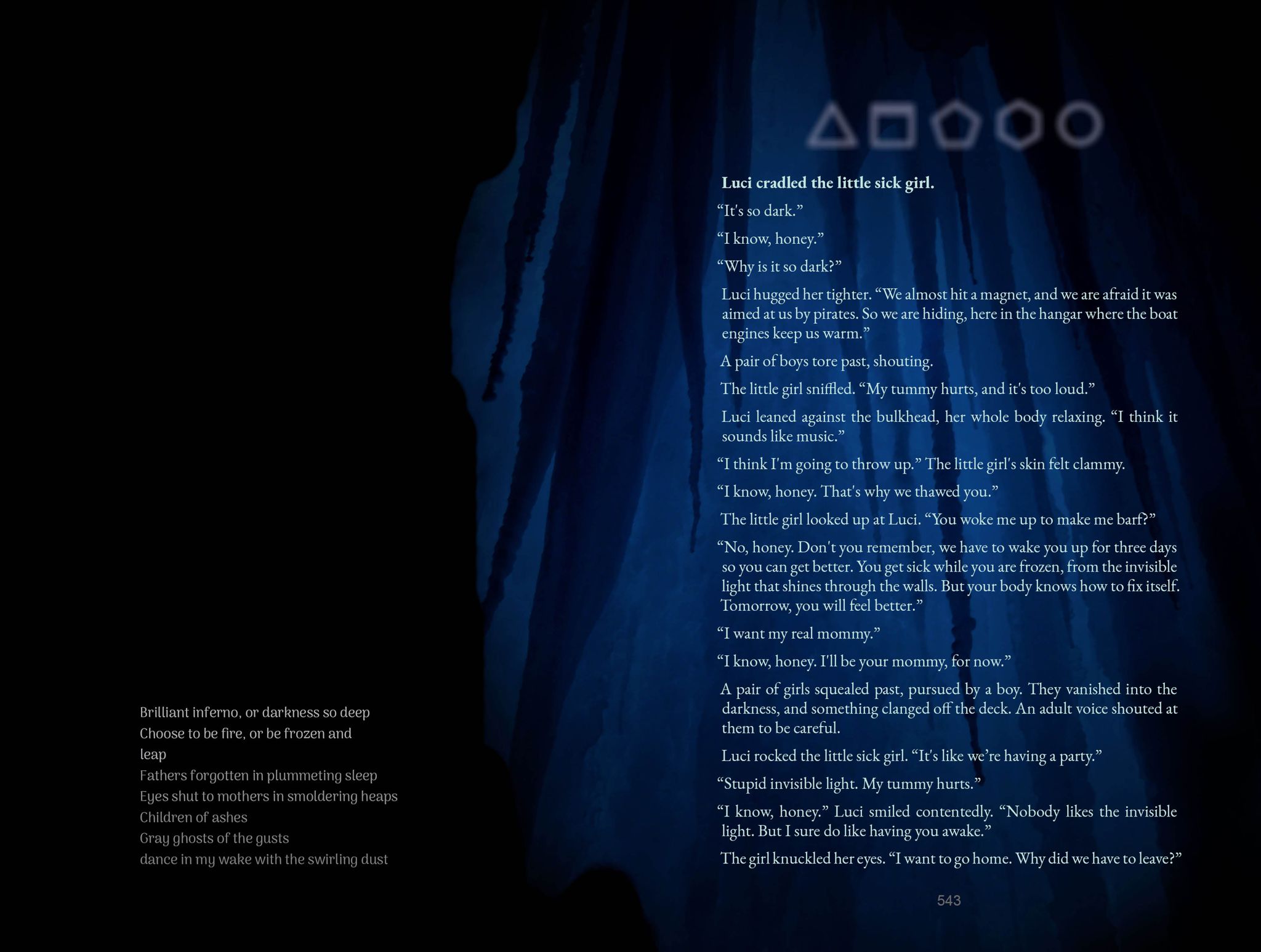
Feelustrations behind the text will peek out between the words and tickle the viewer's brain. But this only works if the picture is mostly dark or mostly light. Unfortunately, most pictures make poor backgrounds because they have too much contrast. That is, they have so much light and dark that neither bright text nor dark text will stand out.
Here is a dark background that primes the concept, invisible light that shines through the walls. It also sets the mood as dark and cold. (It's from Gaia's Wasp.) I'm showing you the whole spread, but you need not read it all to get the idea.
Since you're taking beauty to the next level, maybe you should try your hand at poetry.
Feelustration highlights a story's soul by showing it in two different bodies: the text and the picture.
That last example showed the soul in a third body: the rhyming verse.
Rhyming verse can depict a third body without confusion, because it's obviously not part of the main text.
Here's a different interpretation: In a feelustrated scene, the same idea arrives from two directions, which triggers our pattern detector and makes us notice. The text and picture count as different directions because they depict events that are literally different, but conceptually the same.
We are built to notice ideas that come at us from two directions, so we really notice an idea coming from three. The third direction, the third body for the one soul, is rhyming verse.
Note: The fourth body will be music, when the tech catches up.
Note: Vaguely-relevant snippets from Shakespeare don't sound as clever as you might think.
WARNING: You must not publish your own poetry until you've shown it to a rude person.
Pictures licensed for commercial use (as yours must be) can be photoshopped radically, unless the license expressly forbids it. (No-mods-allowed images are useless, so they are found only on amateur-oriented sites like Flickr.) In fact, some licenses require you to modify the image. (Example: Pixabay.) Just mention that you did it, in the image credits.
For example, here's the raw picture from that last scene, and what I did to it.
If you can't find the right picture, maybe you can assemble it from other pictures.
For example, in Dandelion Slap, I wanted to reinforce the concept, You didn't get there without help, but I couldn't find the right picture. So I put two pictures together.
Every story has a body (the events) and a soul (their meaning.) In a feelustrated novel, the pictures show the soul, so the text can be more subtle.
When you sense the need for an explanation, or an internal monologue, remember a picture is worth a thousand words.
Here's an example from Gaia's Wasp. In this scene, Tom at age eleven loses his father figure.
As they walked Bubba out to his truck for the last time, Tom could not help crying. He turned away, so Bubba wouldn't see. With his back turned, Tom didn't see his mother was crying too.
When he heard the engine start, Tom turned to watch, shoulders slumped, as Bubba's truck vanished from sight.
"Stop whimpering," Scarlet snarled. "You have to be the man now."
Tom flinched, then his face went slack.
Scarlet wiped the tears from her cheeks, and flung them on the ground. "I don't want to see you cry again until you have to shoot your dog."
She did not see Tom cry again.
Bubba was Tom's last father figure.
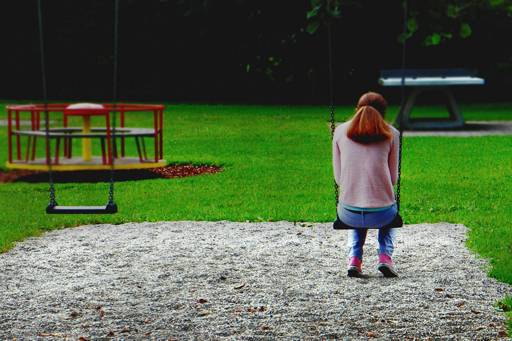
Stories have a soul apart from their body, and so do pictures. This picture's body is a woman on a swing. Its soul is loneliness, and it says it better than words.
Bright pictures look best on paper, but dark pictures set a dark mood.
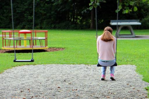
For example, that last picture (the woman on the swing) is about loneliness, so I darkened it to make it more lonely. Here's the before and after, so you can decide if it worked.
As a rule of thumb, a feelustration should be separated from the text by one centimeter (0.4 inches.) But this distance can be adjusted for effects I don't fully understand. Perhaps you can add some insight in the comment forum.
While I don't fully understand white space, I have worked out a couple of the rules:
Isolation implies isolation
In that last example, the lonely woman felt more isolated because her picture was physically separated from the text. Here's the scene without that separation, so you can see the difference.
As they walked Bubba out to his truck for the last time, Tom could not help crying. He turned away, so Bubba wouldn't see. With his back turned, Tom didn't see his mother was crying too.
When he heard the engine start, Tom turned to watch, shoulders slumped, as Bubba's truck vanished from sight.
"Stop whimpering," Scarlet snarled. "You have to be the man now."
Tom flinched, then his face went slack.
Scarlet wiped the tears from her cheeks, and flung them on the ground. "I don't want to see you cry again until you have to shoot your dog."
She did not see Tom cry again.
Bubba was Tom's last father figure.
This woman is lonely, so she should be farther from the text.
She could even be moved to the next page, because she is poignant enough to fill a two-page spread.
Almost touching feels intrusive
A picture bumping up against the text (less than one centimeter separation) feels a little too close, which you might do deliberately. Here's an example from Dandelion Slap, with irrelevant text blurred.
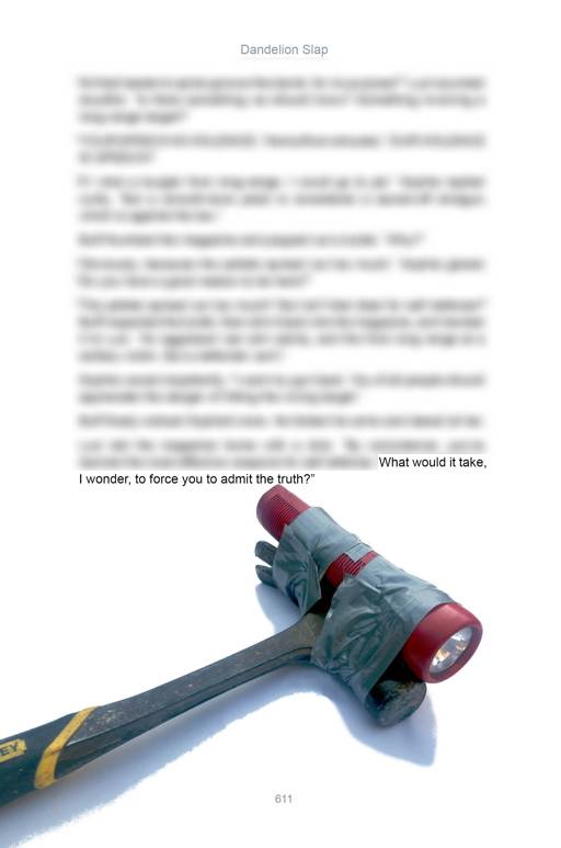
The text is crowded by the flashlight handle. It might be more effective if it was crowded by the hammer head.
If the reader knows what's about to happen, then sees the feelustration, a description might be redundant.
For example, midway through Gaia's Wasp, it was obvious the protagonist was about to lose his virginity. I didn't want to write that scene, so I replaced it with this picture.
Here's how I feelustrate:
Feelustrations should be cropped or edited to focus on their soul. Faces are particularly distracting.
Here's an example, set in a tense, high-stakes negotation. (It's from Dandelion Slap.)
Luci stood behind her glass barrier, glaring at the ambassador. Holding his gaze, she hooked her the Fingers under her blouse, and lifted it to reveal her navel, on her perfectly flat stomach. Then, slowly, she lifted her blouse another six inches, uncovering her tiny bra.
The picture is cropped to focus on its soul, which is, revealing a weapon.
This compels the reader to reinterpret the event, Luci lifting her blouse.
Now here's the same scene with the picture uncropped, so you can judge the cost of irrelevant details.
Luci stood behind her glass barrier, glaring at the ambassador. Holding his gaze, she hooked her the Fingers under her blouse, and lifted it to reveal her navel, on her perfectly flat stomach. Then, slowly, she lifted her blouse another six inches, uncovering her tiny bra.
This doesn't work, because faces command our attention. Instead of, revealing a weapon, this picture conveys only a vague sense of, dangerous woman.
Even worse, this picture comes perilously close to establishing Luci's appearance, wiping out the reader's mental image. Then all feelustrations of Luci would have to use the same face.
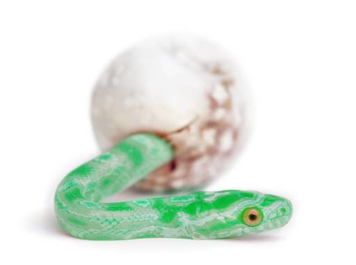
If your picture has a distinctive feature, it's an opportunity. You can amuse the reader by mentioning something visually similar in the text.
Here's an example from Gaia's Wasp. (It will sound wacky to kids who don't remember that it actually happened.)
The local reporter was interviewing State Representative Mirror, who had just sponsored the state's first seat-belt law.
"I am tired of the hysteria," the congressman explained. "So let me be clear: Policeman won't ticket you just for not wearing a seat belt."
The reporter nodded so eagerly her hair bounced. "But, technically, the new law does mention a twenty-five dollar fine."
Congressman Mirror flashed his platinum blonde teeth. "That penalty will only be imposed in unusual circumstances, like an accident."
Heh. Platinum blonde teeth. Sometimes I'm so clever, I can barely stand myself.
A feelustration feels stronger than an illustration because the feelustration differs from the text. Humans pay more attention to ideas that arive from multiple sources. If the picture and text depict the same event, they don't count as separate sources.
Of course, rationally, both the picture and text come from the same source: the author. That doesn't matter. Feelustrations exploit psychology on a mechanical level.
So, if your picture could be interpreted as a mere illustration, perhaps you should adjust your text to add a distinctive mismatch. Here's an example from Gaia's Wasp.
Everyone's paycheck was signed by the owner, the man who'd built it all. He stood six-four in his snakeskin boots, with a generous laugh and a massive belly overflowing his silver belt buckle. As he strolled past, he winked at the ladies. Some winked back.
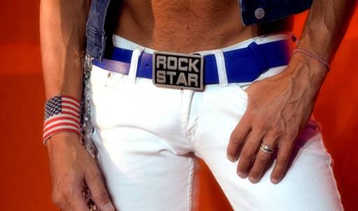
The picture echoes the soul of the text, while contradicting the literal detail, massive belly overflowing his silver buckle. This mismatch is intentional. It highlights the shared soul, which is, rock star.
If the picture and text depicted the same thing, they would be redundant and hence boring. This is why graphic novels have sparse text.
The mismatch between words and pictures allows a feelustrated novel to have more words. The feelustrations might feel pointless, if done poorly, but they won't feel redundant, so a feelustrated novel can have a hundred thousand words. Graphic novels must be shorter because they can't describe the events in the pictures, or they would seem wordy.
But, while some details should be mismatched, others should not. For example:
Colors mentioned in the text feel more vivid when they match colors in the feelustration.
Here's an example from Dandelion Slap.
One day after the first alien message, a lipstick-red spaceship roared into Bart's back yard and blew over the swing set. Bart ventured out to investigate.
The red hatch opened and an alien girl climbed out.
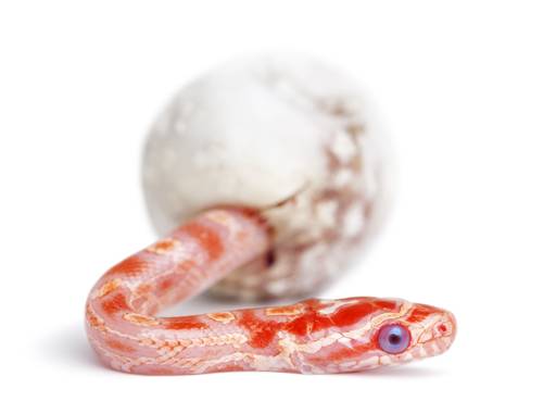
Her cheek was tattooed with the five enigmatic symbols in blue, matching her blue eyes. Her belt was covered in white sequins, and dangled a bag that looked like silk, dyed the color of wet blood to match her ship.
The soul of this picture is, emerging menace, and red.
Notice the echoed detail, the blue eye.
Now here's the same scene with the snake the wrong color, so you can judge how much it matters.
One day after the first alien message, a lipstick-red spaceship roared into Bart's back yard and blew over the swing set. Bart ventured out to investigate.
The red hatch opened and an alien girl climbed out.
Her cheek was tattooed with the five enigmatic symbols in blue, matching her blue eyes. Her belt was covered in white sequins, and dangled a bag that looked like silk, dyed the color of wet blood to match her ship.
Notice how the alien's blue eyes feel lifeless, because the snake's eyes don't match.
A picture sets the reader's viewpoint, which the text should match.
To see why, let's revisit a previous example. But this time I'll show you my first draft, which I wrote from the wrong viewpoint. (I marked my error for you, in bold text.)
I tiptoed to the door, trying not to make a noise. I pressed my ear to the wood, then jumped when the knocker banged again. Was I being paranoid? I peeked through the peephole.
It was just the UPS guy in his brown uniform, standing on my porch with a white-wrapped package. As I watched, he raised the package toward my door, and waited expectantly.
The snake doesn't feel like the UPS guy, because we see it from the wrong viewpoint. We are looking though the peephole, but the snake is facing to the side, instead of looking straight at us.
I had to alter the text, moving the viewpoint from the peephole to the side window, because the viewpoint of a picture can't be changed, with one exception: A picture can be flipped right to left.
In a feelustration, facing Right feels like looking forward, while facing Left feels like looking back. Probably it's because we read from Left to Right, so the Rightward direction is, Stuff that hasn't happened yet.
Here's an example. Fit it to your screen with a pinch or CTRL-Mousewheel.
Note: The picture shows the woman's face and cowboy hat, so the text can't be about a country woman, or the picture would just be an illustration.
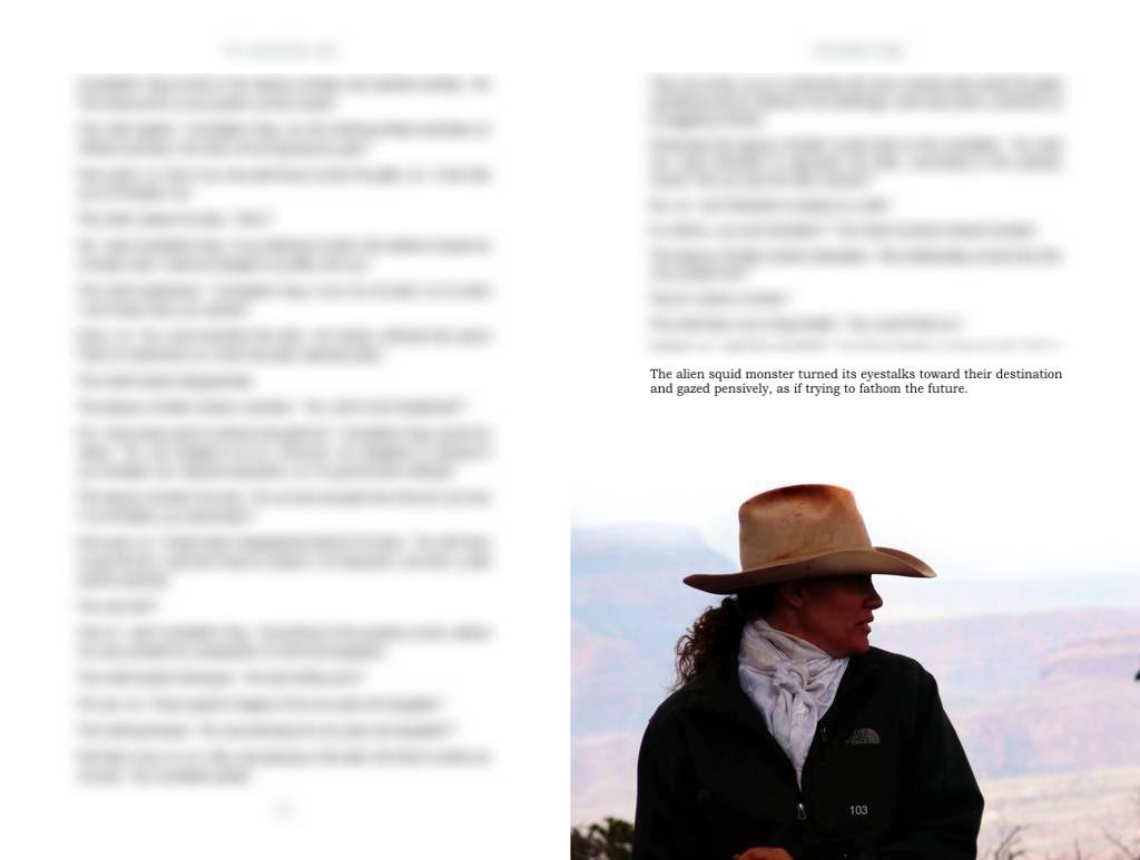
She's looking Right, into the future.
Now see it with the picture reversed.
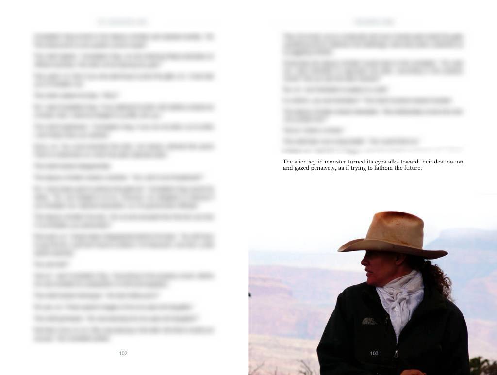
It doesn't work, because the text says she's looking into the future, but in the picture she's looking Left, which feels like, looking back.
Similarly, moving Right feels like an advance, while moving Left feels like, reverse.
This Right-Left asymmetry feels strongest in a printed book, but you can still discern it in this example from Dandelion Slap. In this scene, two humans are planning an expedition through hostile territory, and are debating the tradeoff between armor and speed.
"You need speed, because the wasps will converge on you. By simple geometry, their attacks will grow as the square of time, so doubling your time in transit will quadruple the number of attacks."
"Drat. If we wear enough armor to block a tenth of the darts, but the added weight slows our pace by a tenth..."
"A net loss," the captain confirmed. "Ten percent slower progress will bring twenty percent more attacks."
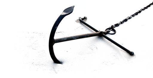
The anchor stops movement Rightward (into the future) so it amplifies the concept, impeding forward motion.
Now here's the same scene with the anchor flipped the wrong way.
"You need speed, because the wasps will converge on you. By simple geometry, their attacks will grow as the square of time, so doubling your time in transit will quadruple the number of attacks."
"Drat. If we wear enough armor to block a tenth of the darts, but the added weight slows our pace by a tenth..."
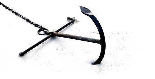
"A net loss," the captain confirmed. "Ten percent slower progress will bring twenty percent more attacks."
If an author is good, I mean really good, he can string pictures together into a story, a multi-frame feelustration.
In this example from Dandelion Slap, a sailing ship was just dismasted by a monstrous wave. The event is feelustrated by two pictures strung together into a similar story.
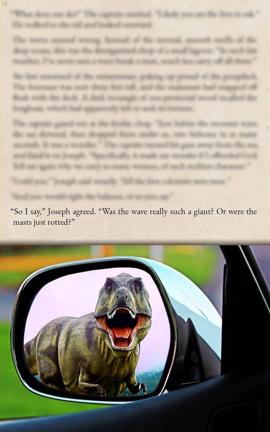
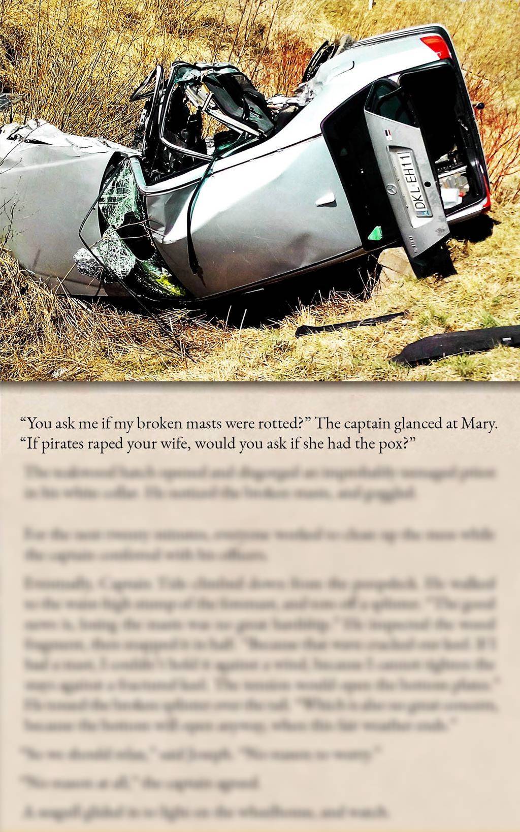
The last sentence before the picture asks, in essence, Was this calamity caused by a real monster?
The feelustrations answer that question with a story.
I can string two pictures together, but I've never managed three. You could be the first.
Feelustrations are metaphors, so they allow multiple meanings. Unfortunately, most of those meanings are boring. So the author should wink at the best, most delightful meaning, ideally in the sentence just before the picture.
On the other hand, a joke should end with the punchline. So consider placing the big reveal at the end of the page. If the page is dominated by a picture that seems unrelated, the ambiguity is vaguely annoying, which is foreplay for the reveal. Ideally, the reveal will come last, at the end of the page. The Aha! moment, when the picture is explained, makes a nice climax.
This only works if the picture dominates the page. If the picture is small, it will likely be forgotten before the reveal.
Formally, a page-dominating picture primes the reader for the reveal, while the apparent irrelevance creates tension that the reveal resolves.
Here is an example.